top of page

Brief
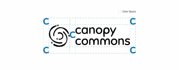
To build a brand identity that strengthens India’s democracy by making citizen engagement proactive, meaningful, and scalable, and delivering assets including a logo, brand guidelines, stationery, etc.
Problem
Citizen engagement often lacks trust, clarity, and accessibility; they needed brand identity that feels safe, empowering, and trustworthy to both citizens and decision-makers.
Audience
Community leaders, organisers, local decision makers, authorities
Key Attributes
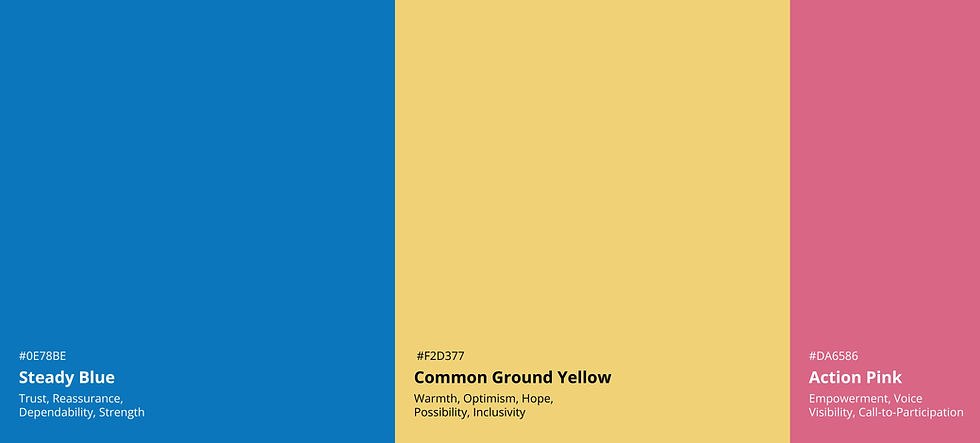
Safe
Empowered Inclusive
Canopy Commons Team - Preferences
I asked the team to share samples of identities that they like and dislike and the reason behind it to give myself a meaningful starting point.
Likes
-
Very strong sense of community
-
Network or a confluence
-
Super simple
-
Hand drawn illustrations
-
Different communities are represented (without a perfect shape)
Dislikes
-
Symmetry with perfect shapes - represents superiority
-
Anything too bold or loud or slightly aggressive
-
Showing the community as a dependent/beneficiary


Typography
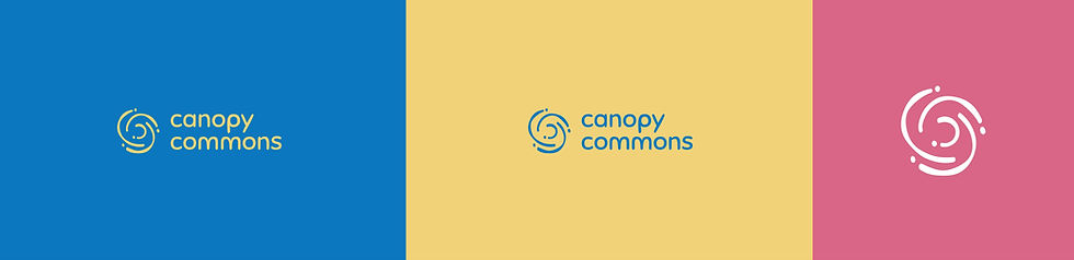
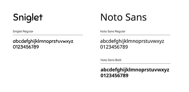
Logo: Humanist typeface, with hand-drawn personality similar to the visual icons
Brand: For CaCo's work in tier 2 cities, it is useful to use a font family that is open-source and multilingual


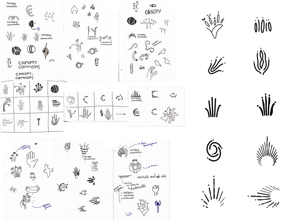
Logos that didn't make the cut!
Design Rationale
Five-part form, collective structure, unity without uniformity, diversity of scale, varied heights, participation
Abstracted “C” letterform canopy structure, collective care, radiating forms, round waves, expression, speaking out
Team
Project Overseen by Jacob Cherian
Consulted by Samira Gupta
Logo design and mockups* by Sakshita Patwa
*Mockups are self-initiated portfolio representations and not company-approved.
bottom of page